Scenario Quadrant
The Scenario Quadrant contains features and tools related specifically to the available scenarios and their selection. These features and tools are located on the Title Bar element on the top left had side of the screen. The selection of a scenario or the change in scenario will have major implications for the data that is displayed by the Web Interface. All the features such as layers, graphs and controls will display data according to the current active scenario.
Menu
The Context Menu element also known as a hamburger menu is located at the top left most side of the screen as seen in the Figure 5.
 Figure 5: Context Menu.
Clicking on the menu will give you access to a panel which will provide you with selection options to display Maps, Charts, Views and filtering of those options via domains (illustrated in Figure 6).
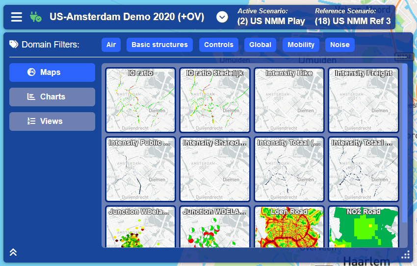 Figure 6: Menu Panel.
Domain Filters
The first element of the Menu Panel is the Domain Filters. These filters are selected by default and can be switched off by clicking on them. If a Domain Filter has been deactivated, Charts and Maps associated with the deactivated Domain will no longer be visible as selectable options. This allows users to more easily find the associated Map or Chart when there are numerous options.
Maps
Maps will be selected and displayed as the first menu option by default. Maps are layers that visually display data indicators for a specific region. You can view a Map layer by clicking on it in the option panel on the right hand side of the Menu Panel. The Map Layer will then be displayed over the main map component on the screen (see Figure 7 below). A legend describing the meaning of the various color overlays on the map will be shown on the bottom left hand side of the screen. Please Note that multiple Map layers can be selected by holding down the ctrl key when making your selections.
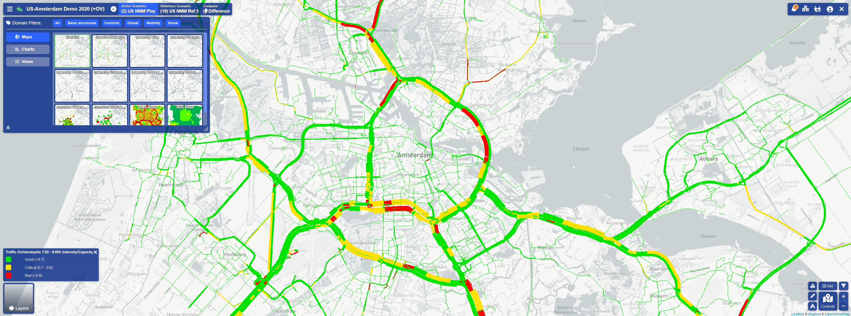 Figure 7: Map Layer Overlaying Base Layer.
Charts
Charts in the Menu Panel function similarly to Maps. In order to view Charts options, you first need to click on the Charts Button located on the left hand side of the Menu Panel. The content in the option section on the right hand side of the Menu Panel will then be updated to reflect the available Chart options. Once the graph has been selected, it will be highlighted in the option section and will be displayed in a Chart Window on the right hand side of the screen as illustrated in Figure 8.
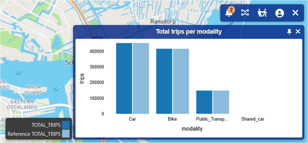 Figure 8: Chart Window.
You can close the Chart Window by either clicking on the x icon on the top right hand side of the window or by once again clicking on the corresponding chart option in the Menu Panel. You can also unpin and move the Chart Window to another position by clicking on the unpin icon next to the close button. To pin it back to the screen, click on the pin icon that replaces the unpin button when a window is no longer pinned to the screen.
*Note: Many windows in the user interface will have this functionality.
Views
Views are a combination of layers, charts, objects and planning map areas that have been selected to display on the Web Interface as a saved state. This feature allows the user to view key data without having to re-select the components individually. In order to create/select a View you must first select Views by clicking on the Views Button on the left hand side of the Menu Panel. You will then be shown a grid of saved Views in the options section and these can be viewed by clicking on them.
There are two ways to add views:
- Clicking on the Add View option in the Options Panel (see Figure 9).
- Right click anywhere on the map and select the ‘save new view’ option.
*Note: You will first need to select all the features you want on to display on the View before attempting to add a View.
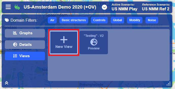 Figure 9: Adding Views.
Connection Status
The Connection Status icon can found next to the Menu icon on the Title Bar (see Figure 10 below). This icon will indicate whether the user interface is connected to the data publisher by displaying as green when connected and red when disconnected. You can manually connect or disconnect the client from the data publisher by clicking on this icon.
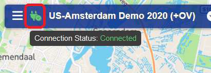 Figure 10: Connection Status.
Scenario Selector
Scenario selection can be accessed by clicking on the down arrow icon on the Title Bar located after the project name as seen in Figure 11.
Clicking on the arrow will open the Scenario Selection Panel. This dialog provides a table of all the available scenarios. You can select your active and reference scenario by clicking on the radio buttons in the desired column as illustrated in Figure 12.
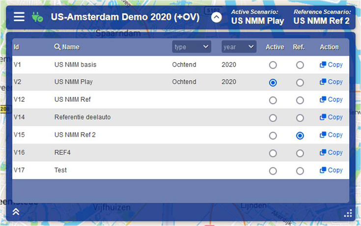 Figure 12: Scenario Selection Panel.
The Scenario Table also provides filtering options for your scenarios in the tables heading row. Lastly you can copy scenario’s by clicking on the copy button in the action column of the table. This will create a clone of the scenario which you selected to copy. This useful when you wish to study data changes without impacting the original scenario.
Active, Reference & Difference
The Active, Reference and Difference components form the last feature of the Scenario Quadrant. These can be found on the right hand side of the Title Bar. They will display the current active and reference scenarios that you have selected. If you have selected a Map Layer, these components become active, and you can click on them to view and compare Map layers specific to the active and reference scenarios. The highlighted component determines whether you are viewing the Map layer from the perspective of the active scenario, reference scenario or comparing them in the Difference view.
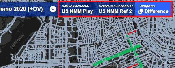 Figure 13: Active, Reference & Difference Indicators.